COLLECTION_ packaging

collection_ packaging by au pays des merveilles

Beautiful packaging can always convince me to spend a few extra euros on a product.  It’s just such a delight to not only buy something useful, but something that’s easy on the eyes as well.  Here are few examples of stunning packaging designs, if you want to see more of them, you can take a look at my pinterest.

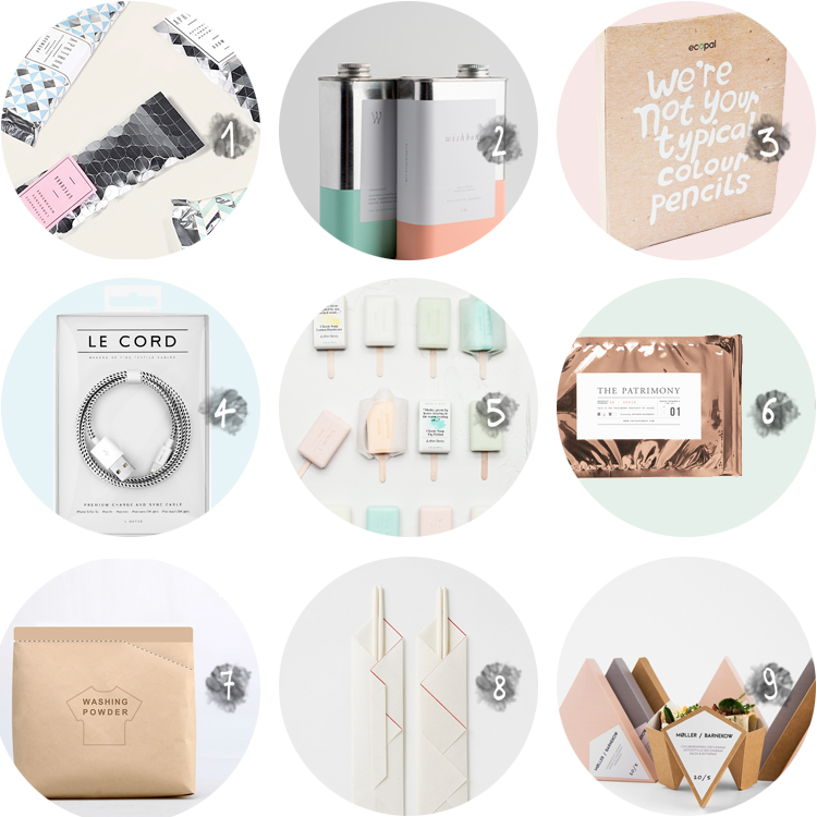
  1. Ice cream packaging by Natasha Chuvinova, see more here.
  2. “Wishbone brew” coffee packaging by Also known as and Christopher Williams,  more info here.
  3. Ecopal wood-free colour pencils by Kathrin Honesta, find out more here.
  4. Le Cord textile cables, buy them here.
  5. Classic soaps by & other stories, get them here.
  6. The patrimony by Object Matter, more images here.
  7. “Tear off a scoop” packaging by Yang Guo, Qiaoge Yang & Wenju Wu, get to know more here.
  8. Rice paper samples, more photos here.
  9. Moller Barkenow sandwich wrap by Tobias Moller and Rasmus Erixon, discover more here.

Weekend-blog-awards-2015

PRETTY THINGS: packaging

PRETTY THINGS packaging via au pays des merveilles

12345678

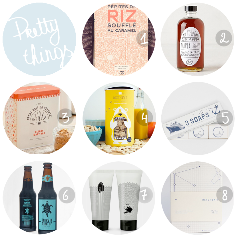
Surely most of you have seen photos of the latest Chanel fashion show, for which Karl Lagerfeld and his team turned the Grand Palais into a supermarket, where every packaging down to the last detail was redesigned (see number 1).  The result was of course amazing and turned the show’s guests absolutely crazy.   It made me dream of a real life supermarket with nothing but well designed products,  thereby improving my everyday groceries experience, but also be very painful for my wallet, without a doubt.  So I figured it was about time I shared my favorite pretty products with you again!  It’s been a while since I did (see here, here and here) and I had a very hard time picking favorites from my pinterest board, so I figured why not share a few extra favorites?

Read More

PRETTY THINGS: from Portugal

PRETTY THINGS portuguese design via au pays des merveilles

This blog post has been on my mind for so long, but it’s only now that I’ve found some time to actually finish it.  During my 5 month stay in Portugal (and the several trips I’ve made there ever since), I’ve discovered lots of Portuguese talent that I’ve been wanting to share with you, so here they are!

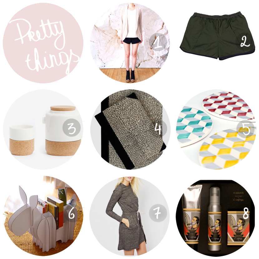
  1. Best Sunday Dress stands for everything I could possibly desire from a fashion brand: apart from working only with sustainable and ethical materials, they also aim at a sustainable design aesthetic by using simple lines and special details, resulting in items that are interesting and basic at the same time.  I own the runner shorts, made out of the softest recycled polyester and I wouldn’t mind adding more items from their line to my wardrobe.
  2. Wetheknot makes board shorts out of the textiles of broken umbrellas, resulting in unique items.  Also worth checking out: their limited edition backpacks out of quilted cotton.
  3. Raquel Castro and Francisco Vieira Martins, alias Alma Geméa (Portuguese for soul mate) designed this beautiful tea set for their product line ‘The Whistler’, named after one of the oldest cork oak trees of the world, which can be found in Alentejo.  The line beautifully mixes cork with ceramics and I’m absolutely in love with it.  Available here.
  4. Handmade Emílio Braga Notebook, with a cover made from vintage Portuguese wall paper and named after the founder of one of Lisbon’s best stationary shops which is now over a century old.  Available here.
  5.  Handceramics makes pan stands and coasters with prints inspired by the typical Portuguese tiles.  Available here.
  6.  Toyno is a collection of cardboard animals that are willing to hold your stuff for you, every one of them with their own personality.  Their office used to be located in my street in Lisbon and walking past it would always bring a smile to my face.
  7. White Tent is the brand of Russian-Portuguese duo Evgenia Tabakova and Pedro Noronha-Feio, which gives a lot of importance to sustainability and exploring new design concepts such as laser cutting, combined with a minimalist aesthetic.  Available on asos.
  8. I’ve already proved to you that Portugal has the most beautiful packaging, and this is yet another example: O Melhor shaving cream, after shave and soap by
    Confiança, a company founded in Braga in 1894.  Available here.

If you do happen to go to Portugal (Lisbon in particular) and you want to score some original Portuguese products, you should go to A Vida Portuguesa, Feira das Almas, Fabrica Features or LX factory, but you can read all about that (and more) in my Lisbon guide.

Follow me on bloglovinfacebookpinterest, flickr and tumblr.

PRETTY THINGS: light bulbs

pretty lightbulbs via au pays des merveilles

Despite – or maybe even thanks to?- the energy saving lamp, designers have been focusing their attention to the classic light bulb for a while, giving it new shapes or putting it in the spotlight with beautiful sockets.  I’ve collected my favorites for you!

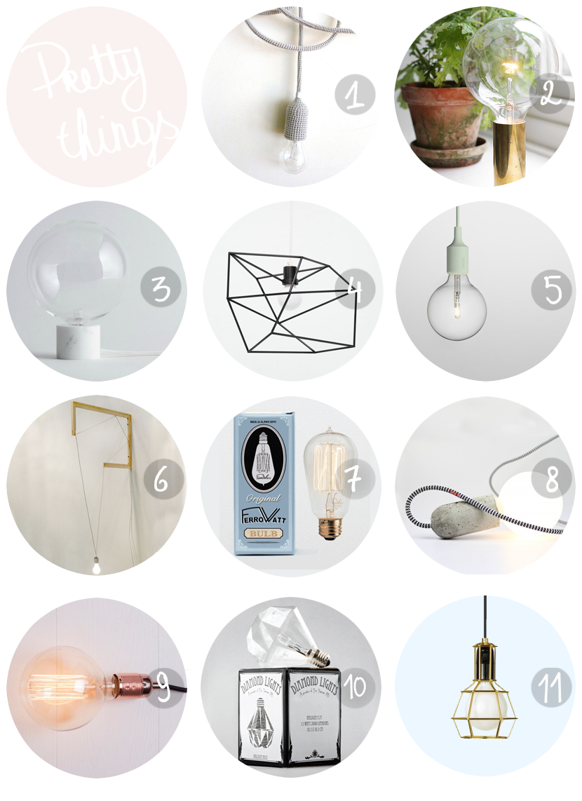
  1. With some help from a talented grandmother, you might be able to make your own version of this knitted lamp from byBLINE, no?
  2. If you’ve got some swedish up your sleeve (or google translate on your side) you can figure out how to DIY this golden beauty.
  3. The beautiful Marble Light Collection by studio vit. (source)
  4. Small Spica by Iacoli & McAllister gives a beautiful light bulb all the attention it deserves.
  5. This mint version is my favorite, but Muuto’s E27 pendant lamp is available in many other colors as well.
  6. Noam Rappaport puts the light bulb in the spotlight with just some wood and plastic cables.
  7. I think I featured this one on the blog before, but Ferro Watt produces the most beautiful lightbulbs, based on Edison’s authentic design.  The beautiful packaging is a bonus.
  8. Base is a design from the NUD collection, and nothing more than a lightbulb with a beautiful concrete socket and a cord that comes in 44 colors.
  9. The atelier lamp by Frama is a beautiful twist on the regular lightbulb.  Available here.
  10. Eric Therner’s Diamond Light has been going around the blogosphere for a while, but I had to include this one!  You can buy a similar one here.
  11. This work lamp inspired golden girl is available here, but I have to admit I really like the classic work lamp as a design element too.  (It’s a pity I can’t remember where I have seen this being used…)

Follow me on bloglovinfacebookpinterest, flickr and tumblr.

A VIDA PORTUGUESA

au pays des merveilles

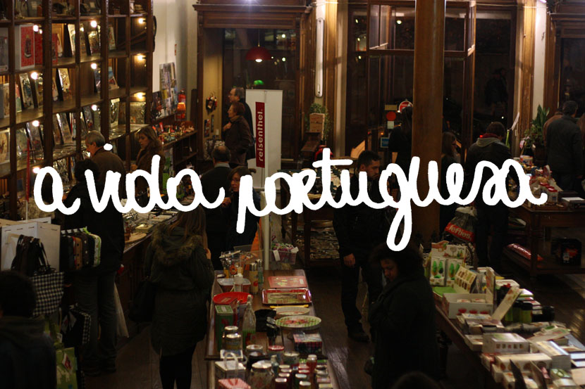
You already know I have a slight obsession with beautiful packaging (see my branding pinterest board and thisthis and  this post), so when I entered  ‘A Vida Portuguesa‘, I thought I was in heaven.  This store sells all kinds of authentic portuguese products, from sea salt to soap and from notebooks to sardines and all are wrapped in the most beautiful packaging.  Unfortunately it’s a little bit expensive, and some of these items you can find cheaper in local drug stores, but the shop is beau-ti-ful and it’s fascinating to roam around and check out everything they sell.  The photos from this post are taken when I went  to Porto (it’s one of the shops in Rua da galeria de paris, which I talked about yesterday), but they also have a shop in Lisbon, located in a really cool old building but a lot smaller.  Anyway, if you’re in Lisbon or Porto and looking for souvenirs, this is where you should go.

Read More

PRETTY THINGS: packaging

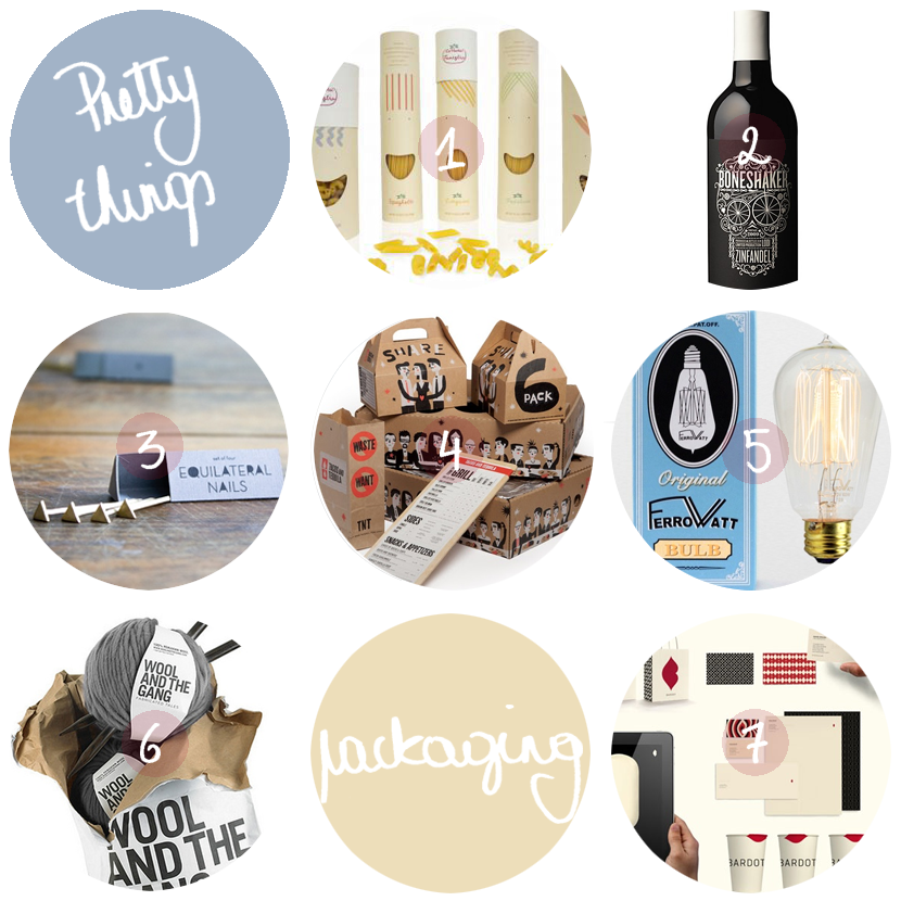
  1. Packaging for ‘la pasta famiglia’, where each family member is represented by a different kind of pasta, illustrated as the family member’s hair. (source)
  2. Boneshaker wine.
  3. Beautiful equilateral nails by Winsome Brave.
  4. Packaging for Tacos and Tequila. (source)
  5. Ferrowatt was founded in the 19th century and has been making lightbulbs as Thomas Edison designed them.  (source)
  6. Wool and the gang‘s diy packages.
  7.  Landor Associates did this wonderful branding for the Bardot ice cream chain.  (source)

Follow me on bloglovinfacebookpinterest, flickr and tumblr.

PRETTY THINGS: packaging

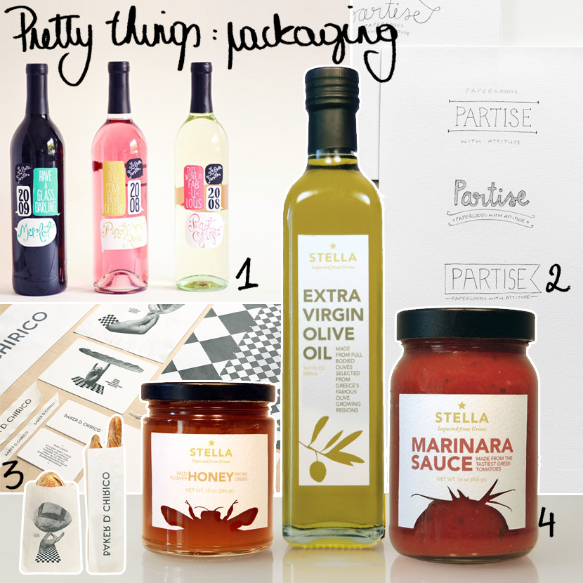
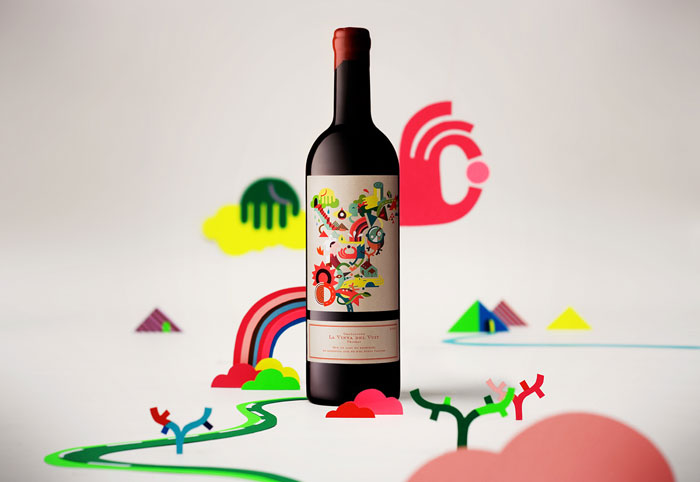
  1. I think I’ve told you before how I choose my wine: I just go with the prettiest label.  No need to tell you this would be my pick!  (by Ali Labelle, source)
  2. It’s always inspiring to see the design process, right?  Claire from fellow fellow posted a few sketches of a logo for an online shop.
  3. Amazing branding for a bakery.   I know where I’ll get my baguettes when I’m in Melbourne! (by Fabio Ongarato, source)
  4. This design for a fictional brand of high-end greek imported products, is the result of a graphic design assignment at the IED Barcelona, Spain.  (by Mergime Raci, source)

Follow me on bloglovinfacebook, flickr and tumblr.

PRETTY THINGS: paper & packaging

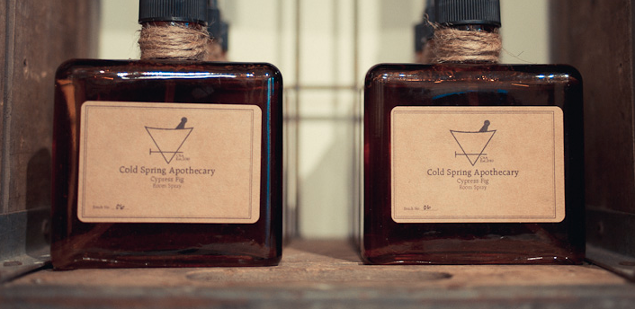
1.  Cold Spring Aptohecary has the most beautiful packaging and a very environmental friendly philosophy too.  Too good to be true, you say?

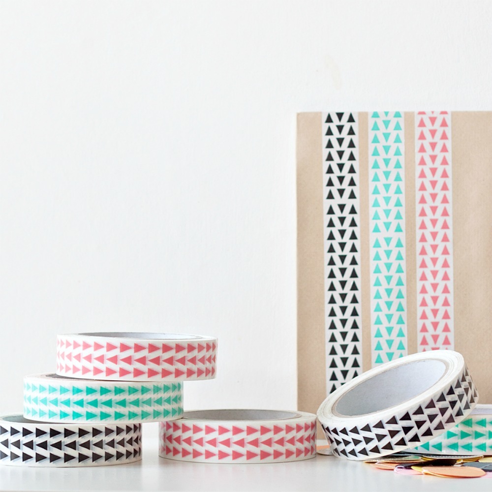
2.  Pretty tape with pretty hipster triangles.  Availble at seventy tree.

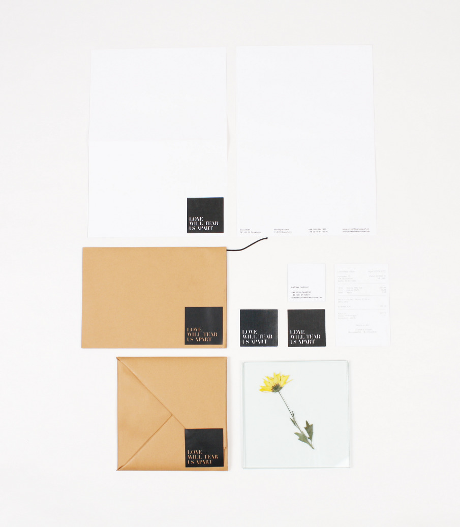
3.  Unfortunately, this branding and packaging is for a fictional flower shop, but if it looks this good and if it’s named after a joy division song, someone should make this happen.

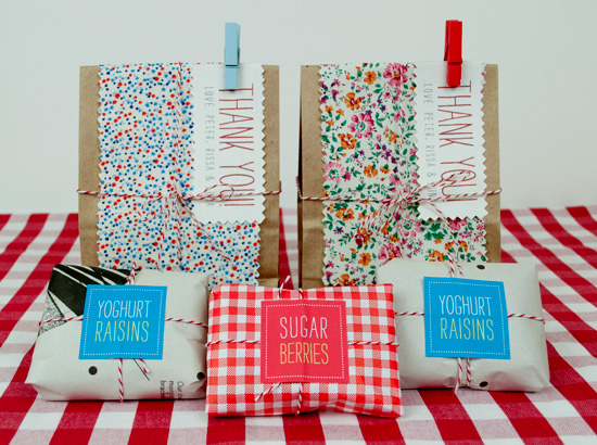
4.  Colorful goodie bags, and apparently not that hard to make at all.  (source)

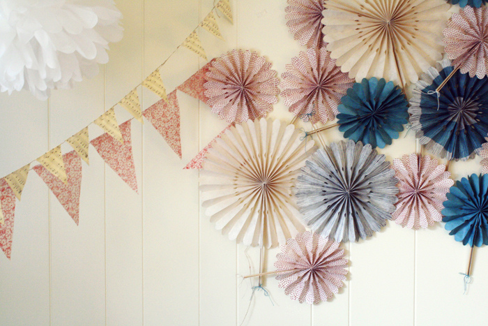
5.  Wonderful decoration.  (source)

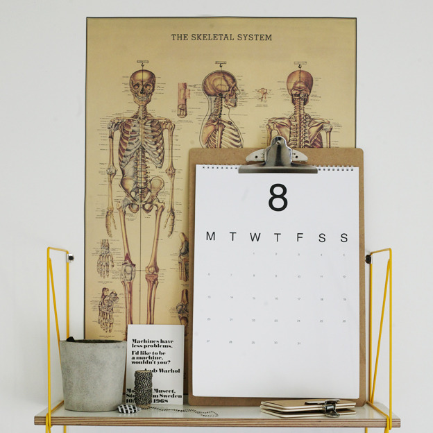
6.  Perfect basic calendar from rk design.  (Unfortunately sold out, but I don’t think it’s that hard to make one yourself, shh.)  Don’t forget to check out the designer’s blog, it’s one of my favorites!

7.  Since I know absolutely nothing about wine, I always choose wine according to the most beautiful packaging (preferably with animals on it).  Unfortunately, pretty designs are quite hard to find in our local supermarket.  If only I would find this bottle of wine on the shelves!  (source)

Follow me on bloglovin, flickr and tumblr.

THINGS THAT MAKE ME SMILE

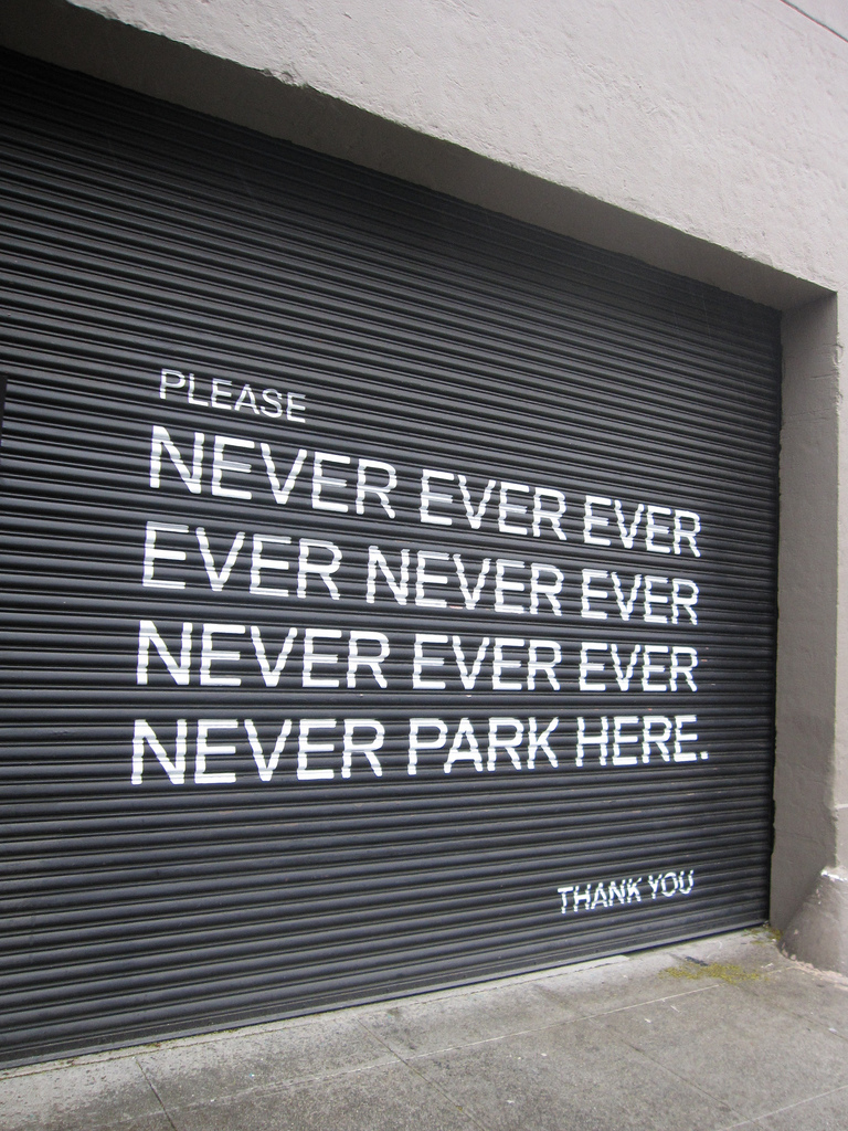
1.  So much better than the regular ‘don’t park here’ signs!  (source, photo)

2.  Tiffany prepares sandwiches and cakes with ingredients from the farmer’s market, wraps them up in ecological packaging, stacks them in an old suitcase and delivers them on her wonderful pink bike.  Only in Paris though!  Why don’t we have something like tifamade here in Belgium…

3.  Custom made Olympus Pen F in black and wood finish.  Yes please!  (source)

4.  Wonderful stairs.  (source)

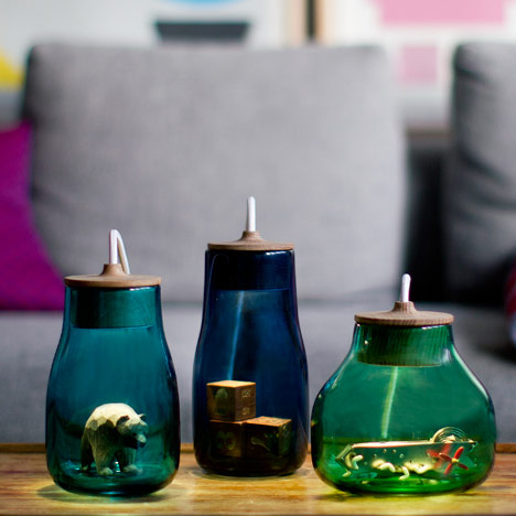
5.  These light jars, designed by  Kristine Five Melvær, are meant to showcase small, precious belongings.  Inside the wooden stopper is a light source that highlights your time of choice.  (source)

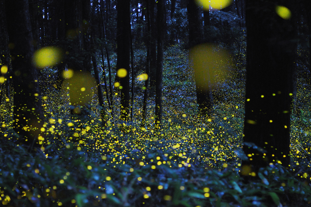
6.  Aren’t these long exposure photographs of fireflies just magical?  (source)

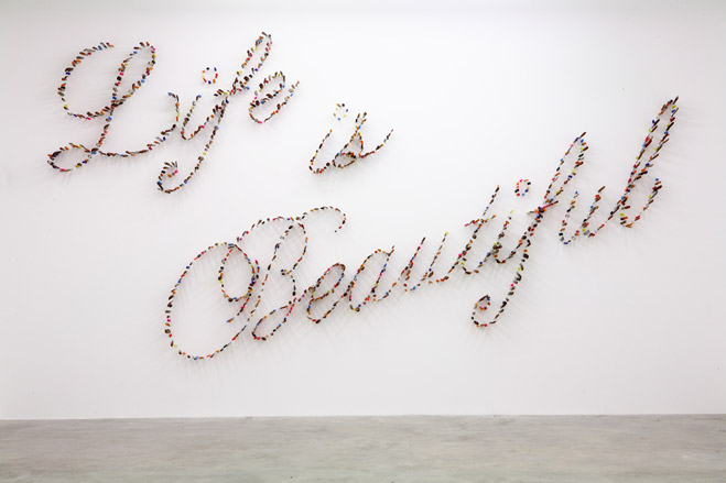
7.  Life is beautiful by farhad moshiri is made out of hundreds of knives stabbed into the wall.  (source)

8.  Kyle Kirkpatrick carves imaginary landscapes out of old books.   (source)

9.  Sculpture by Myeongbeom Kim.  (source)

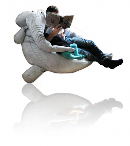
10.  TANTO is the most wonderful bean bag I’ve ever seen. Get it here. (source)

Follow me on bloglovin, flickr and tumblr.

THINGS THAT MAKE ME SMILE

1.  Iphone covers inspired by bunnies are becoming a fashion item.  (source)

2.  Pablo Picasso wearing a cow’s head on the beach in 1949.

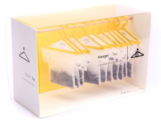
3.  Wonderful packaging for tea by Soon Mo Kang.  So clever!  (source)

4.  The Koloro-desk by  Torafu Architects looks like a fun workspace where you can get some privacy without being locked up.  (source)

[vimeo=http://vimeo.com/37070907]

5.  Smart bookmarks, the Albratos!  They follow your reading, so there’s no more losing track of the right page.  Very clever.  (source)

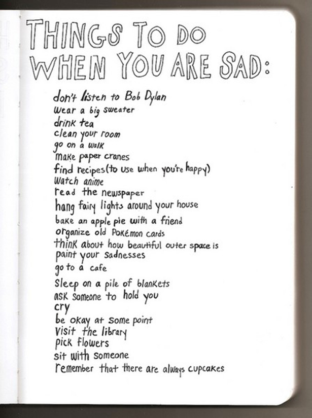
6.  Some good advice.  (source)

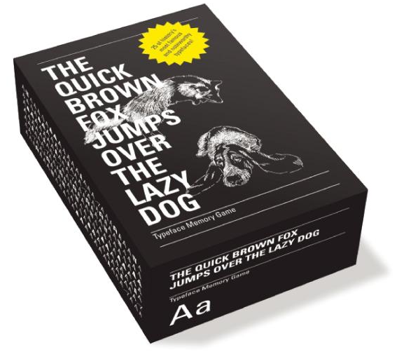
7.  This memory game is a little more advance than most of them: instead of disney characters (like the one we had at home), you have to recognize and remember the typeface.  Should be an easy game to win for the graphic designers among us…  Buy it here.

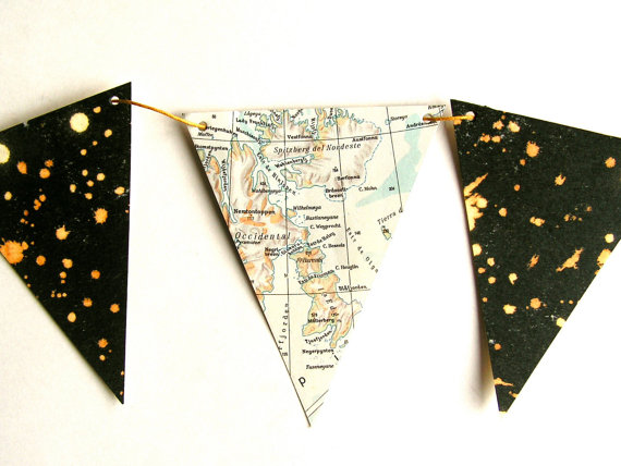
8.  Cheerful bunting which would look pretty good in my room too.  Available here.  (source)

9.  Christophe Coppers‘ art.  (source)

10.  If we can share apartment blocks, then why shouldn’t birds do the same?  Vogelflat gives it a try!  (source)

Follow me on bloglovin, flickr and tumblr.