COLLECTION_ interior diy’s

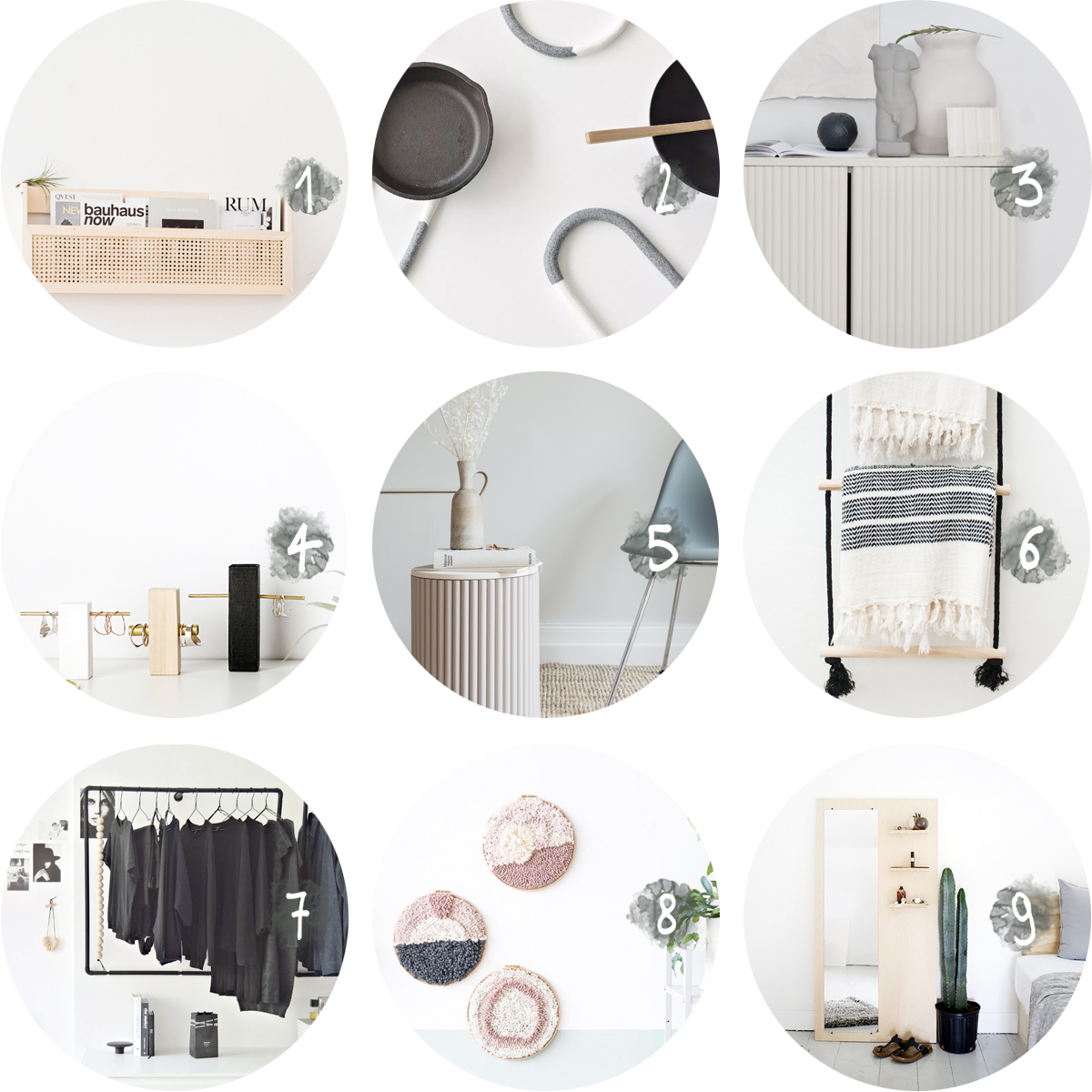
Now that I’m making big changes in my apartment (more on that later!), I’m constantly on the look out for affordable solutions that will easily help me give my interior a unique touch.  Reminding myself that everything looks different with a fresh coat of paint is one approach, scouring the internet for interior DIY’s is another one!  Since I have a hunch that you too might be interested in my favorite finds, I’ve collected my most recent discoveries in this blog post.   Curious for more? Have a look at my archive or Pinterest board then!

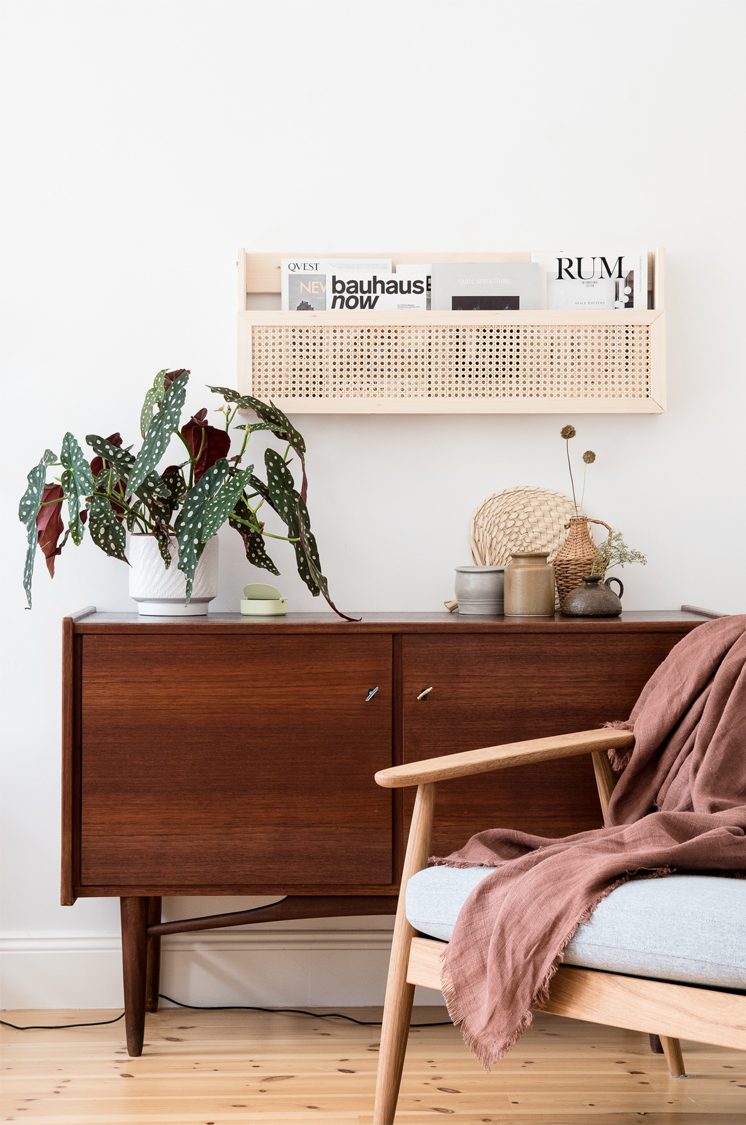
  1. Magazine rack, discover how to make it here.
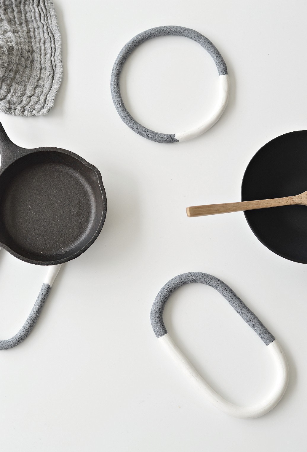
  2. Faux granite trivets, find the instructions here.
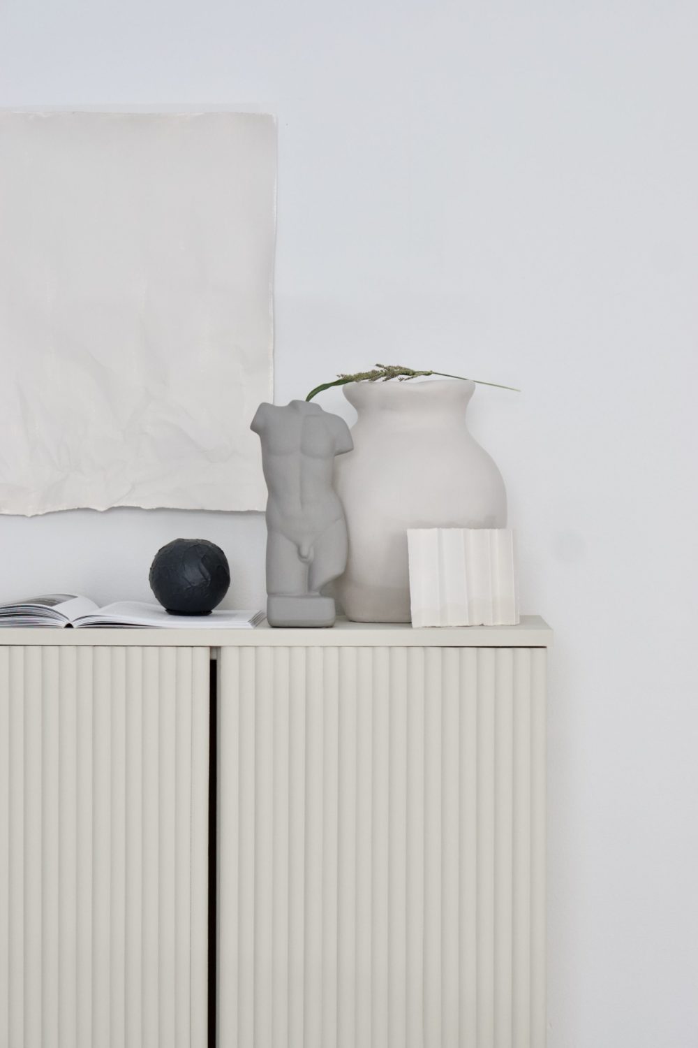
  3. Ikea IVAR hack, read all about it here.
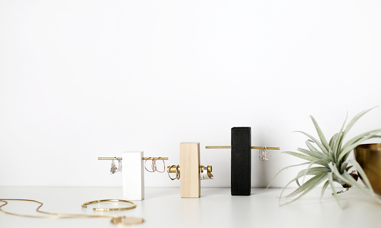
  4. Brass and wood ring holder, learn how to do it yourself here.
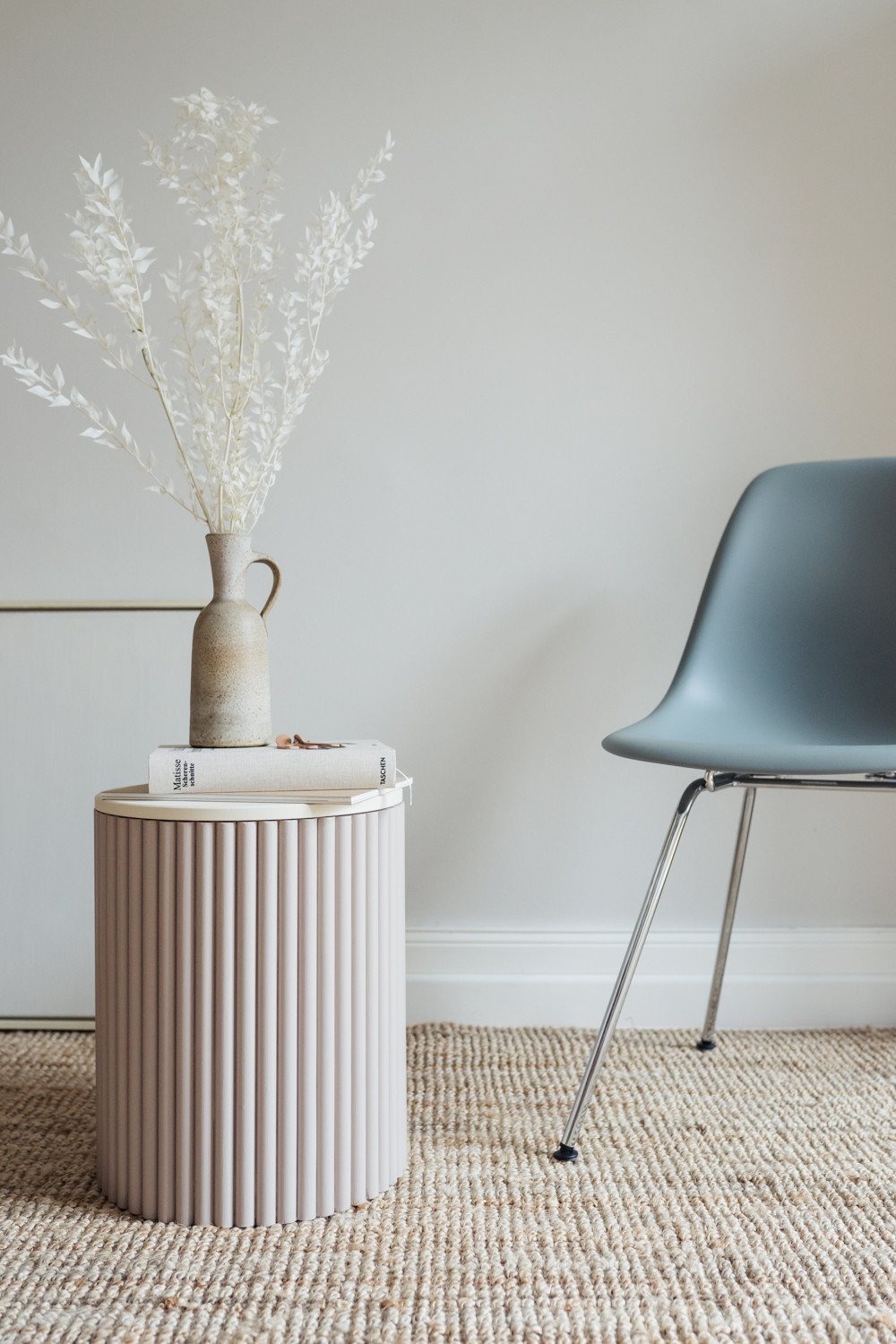
  5. Sidetable, find the how-to here.
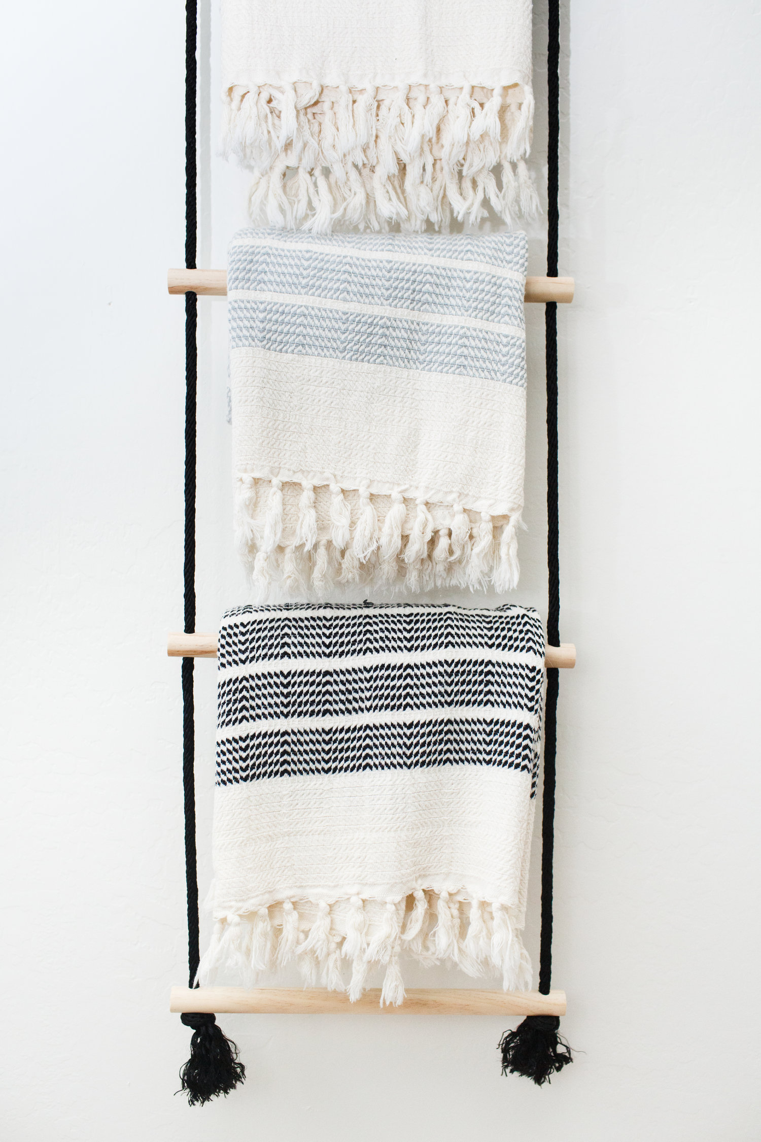
  6. Hanging ladder, discover the tutorial here.
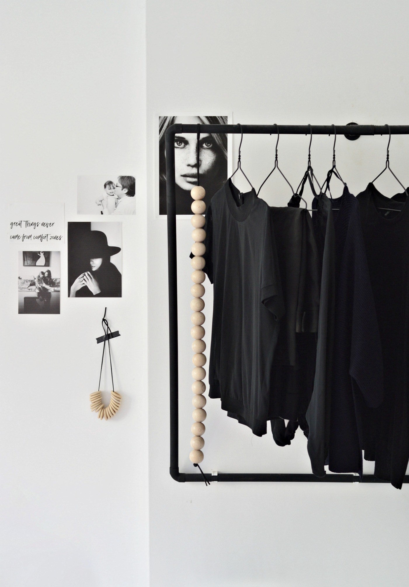
  7. Wall mounted open wardrobe, find out how to make it here.
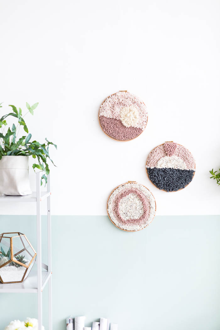
  8. Punch rug art work, discover the instructions here.
  9. Plywood floor mirror, learn how to make it here.
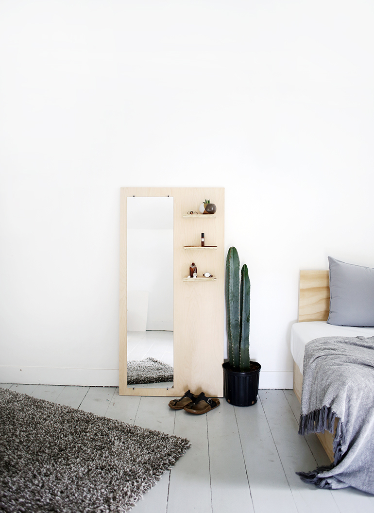
COLLECTION_ interior DIY via aupaysdesmerveillesblog.be - plywood floor mirror by the merry thought
COLLECTION_ interior DIY via aupaysdesmerveillesblog.be - minimal sidetable bycraftifair COLLECTION_ interior DIY via aupaysdesmerveillesblog.be - hanging ladder by avestyles
COLLECTION_ interior DIY via aupaysdesmerveillesblog.be - brass and wood ring holder by the merry thought
COLLECTION_ interior DIY via aupaysdesmerveillesblog.be - wall mounted open wardrobe by your diy family
COLLECTION_ interior DIY via aupaysdesmerveillesblog.be - diy magazine rack by craftifair
COLLECTION_ interior DIY via aupaysdesmerveillesblog.be - Ikea ivar hack by an interior affair
COLLECTION_ interior DIY via aupaysdesmerveillesblog.be - faux granite trivets by your diy family
COLLECTION_ interior DIY via aupaysdesmerveillesblog.be - punch rug art work by fall for diy

EXPLORED_ The Dammhus

EXPLORED_ The Dammhus - Hannelore Veelaert for aupaysdesmerveillesblog.be

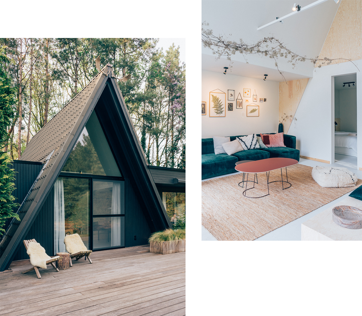
Spending a few days in a cabin in Sweden has been on my wishlist for quite a while, but I haven’t made it there yet because Scandinavia is so damn expensive and time is always an issue.  However, I don’t have to fly to Sweden anymore to make my cabin dream come true!  The Dammhus brings that Scandinavian feeling to the North of Belgium, and does so in style.  A while ago, I was asked by a Belgian magazine to photograph the recently opened cabin, which had been on my must-visit list ever since I first scrolled past in on Instagram, so you could imagine my delight!  Unfortunately I didn’t get to spend the night at the time, but if the beds are as comfy as the interior is pretty, waking up here must be a dream come true.  Speaking of that pretty interior; the couple of the Dammhus had a little help from their inlaws of Espoo, which explains the picture perfect Scandinavian look!

Surrounded by a private forest, overlooking a picturesque lake,  housing four bedrooms, no less than twelve beds and two bathrooms and only an hour away from Antwerp city, it’s the perfect getaways for families and groups of friends that want to escape the city for a few days.  I’m already checking my calendar as to when I can try out those beds myself…

The Dammhus - 2382 Poppel, Belgium - website - instagram

Read More

AT HOME_ my dining room

Fragments_ dining room - Hannelore Veelaert via aupaysdesmerveillesblog.be

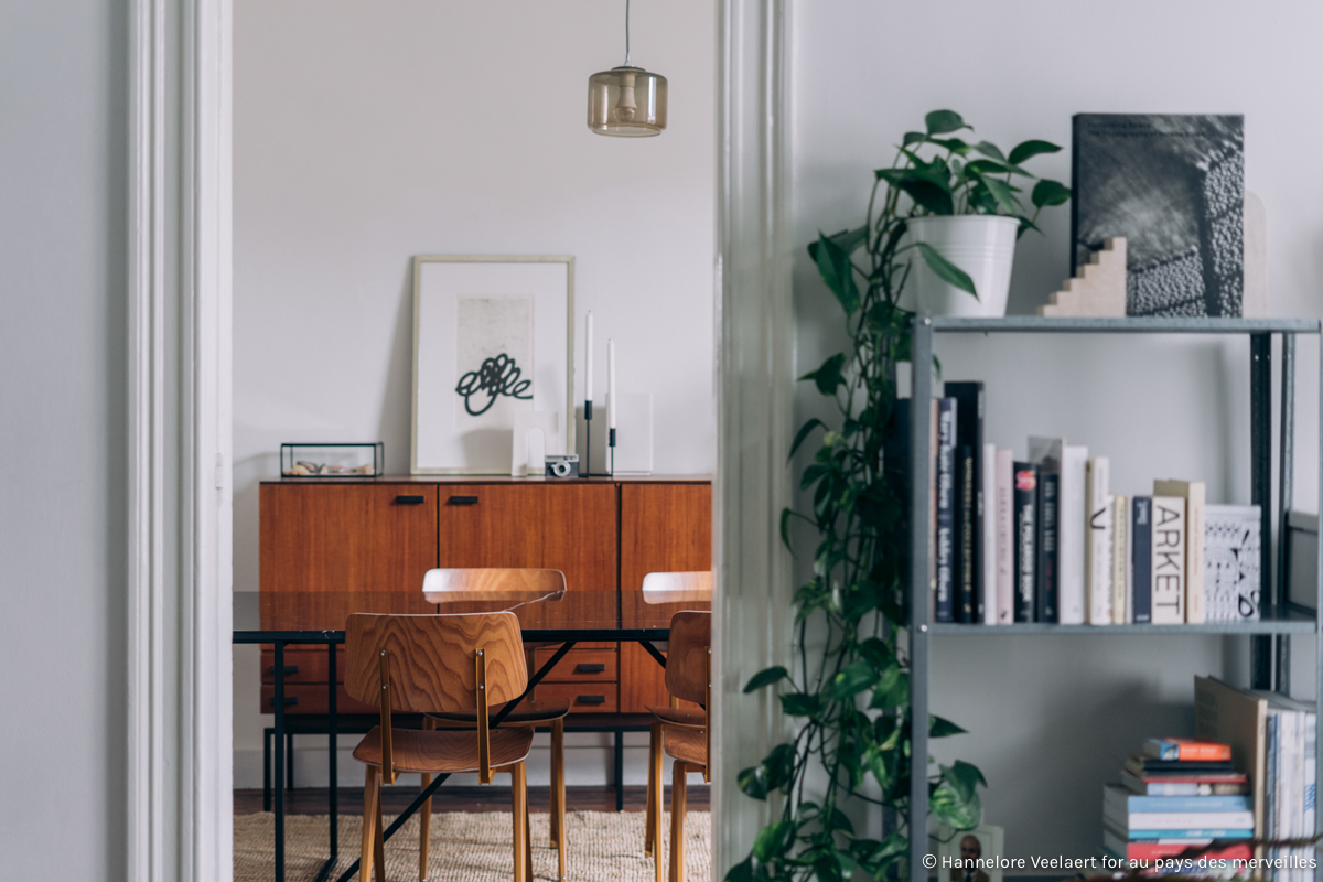
Of all the rooms in my house, the dining room took the most effort to get together.  I arrived in this apartment with a simple table and the three chairs (I couldn’t fit more) I borrowed from my parents for my studio apartment.  The combination already looked bleek in the dining room of my next apartment (which was a little bigger), but when I upgraded again, the dining room looked downright sad.

I could easily picture what I wanted it to look like, but it took me a good year to find the perfect pieces and – not entirely unimportant – save money to be able to afford them. I didn’t exactly buy the furniture in a logical either, as I was still saving money for my table and chairs when I bumped into the perfect sideboard at a vintage web shop and couldn’t resist buying my dream carpet at a 40% discount (which I have moved to the living room, where it’s safer from stains, and have replaced with a different one recently).   A few months later the carpet and sideboard were joined by a marble table, after which I only had to decide on the color combination of my chairs (with a little help from you in my Instagram stories!) and wait patiently for the custom color combination to arrive at my doorstep…  My plants and deco still regularly switch places here (as they do in the rest of the house) but the core pieces of this room are definitely here to stay.  Enough talking now, let’s have a look at the final result!  In case you’re wondering, you can discover where I bought all these pieces at the bottom of this post.  I’m curious to hear what you think!

Read More

COLLECTION_ interior inspiration by Studio Scott

COLLECTION_ interior inspiration by Studio Scott via aupaysdesmerveillesblog.be

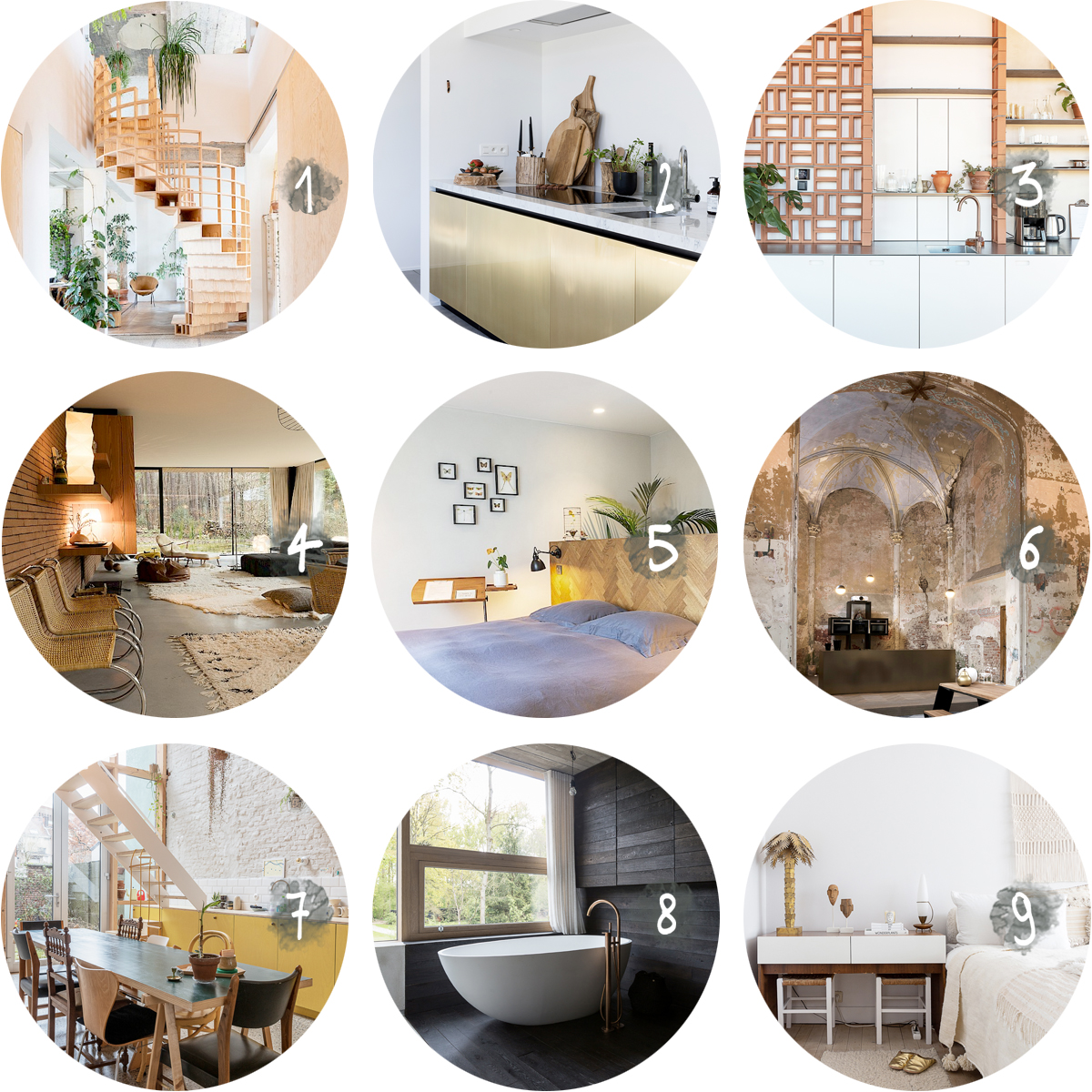
Real homes are an endless source of inspiration for me, and with a little help from Studio Scott I’ve collected nine of those in this blog post!  Studio Scott is the place to be for unique locations for photo shoots, film sets and events, but even if you’re not scouting locations or occasionally want to rent out your own home, their website is worth checking out.  With over 400 very divers locations, there’s no doubt you’ll find some interior inspiration there!  I’ve gathered nine of my favorites here, but you might want to have a look at their website or Instagram account for more!  You might even spot a few that I shot for the blog in the past…

Read More

AT HOME_ another living room update

FRAGMENTS_ living room update - Hannelore Veelaert for aupaysdesmerveillesblog.be

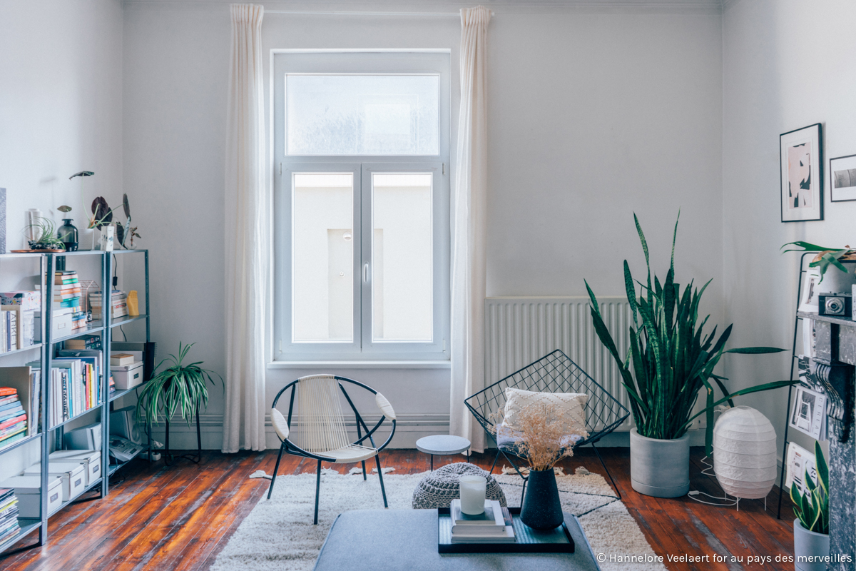
My home is a never ending work in progress, a point I want to proof today by showing you the result of my latest living room update.  You might have caught a glimpse of it already on my Instagram stories (you can relive the evolution of my interior in detail here) or in a few magazines (that’s right, my interior has been published both in Sjiek magazine and the Belgian and Dutch Flair magazine in the past few weeks), but I still wanted to share the result in detail on the blog.

The biggest change with my previous update is probably the carpet swap.  I initially bought this super cozy carpet for the dining room but ended up stressing too much about stains to thoroughly enjoy it.   Thus I moved the previous carpet to the bedroom and moved this fluffy wonder to the living room.  I’ve also moved my DIY sidetable (which I’ve made years ago) to the wall, where it is less distracting.  I’m super pleased with the result, as it is much calmer than before (you can see the evolution yourself here and here), but I have to admit I’ve made more changes since I took these shots… I’m not quite done with this room yet, so you can expect more updates in the future.  In the meantime, I’m curious to here what you think of this update!

Read More

WORK_ Opum development

WORK_ Öpum Development by Hannelore Veelaert for aupaysdesmerveillesblog.be

When selling real estate, the details are everything.  Nothing makes a potential buyer dream more of moving in than a well thought out (temporary) interior and an impeccable styling… The people behind Öpum are well aware of the advantages of home styling and thus the couple asked to shoot their own home – their masterpiece – to kick-start their business on social media.  It’s been almost a year since I took these pictures and I don’t know why I haven’t shared them sooner.  With it’s overload of authentic details and carefully selected vintage pieces, this home is brimming with interior inspiration… I for one wouldn’t say no to that deep blue velvet Togo sofa… Even if buying or selling real estate is not on the agenda anytime soon, you still might want to take a look at Öpum’s website, since they also have an online shop where they sell some of their (vintage) interior finds!

Interested in more of my work for Öpum?  Have a look at my portfolio!

Read More

WORK_ home office by studio boîte

WORK_ home office by Studio Boîte by Hannelore Veelaert for aupaysdesmerveillesblog.be

Some projects are an absolute joy to photograph, of which Edith Macken‘s designs definitely are a perfect example.  Since our last collaboration, she has teamed up with her husband Arnaud de Vicq as Studio Boîte, but the keywords of their work have remained the. same.  Colors, textures and attention to detail are a given, as this shared home office for wedding photographer Sleen and architect Davy Nekkebroek proves.  Curious to see more of their work?  Have a look at their website, my portfolio or my archives.

Read More

COLLECTION_ ceramics

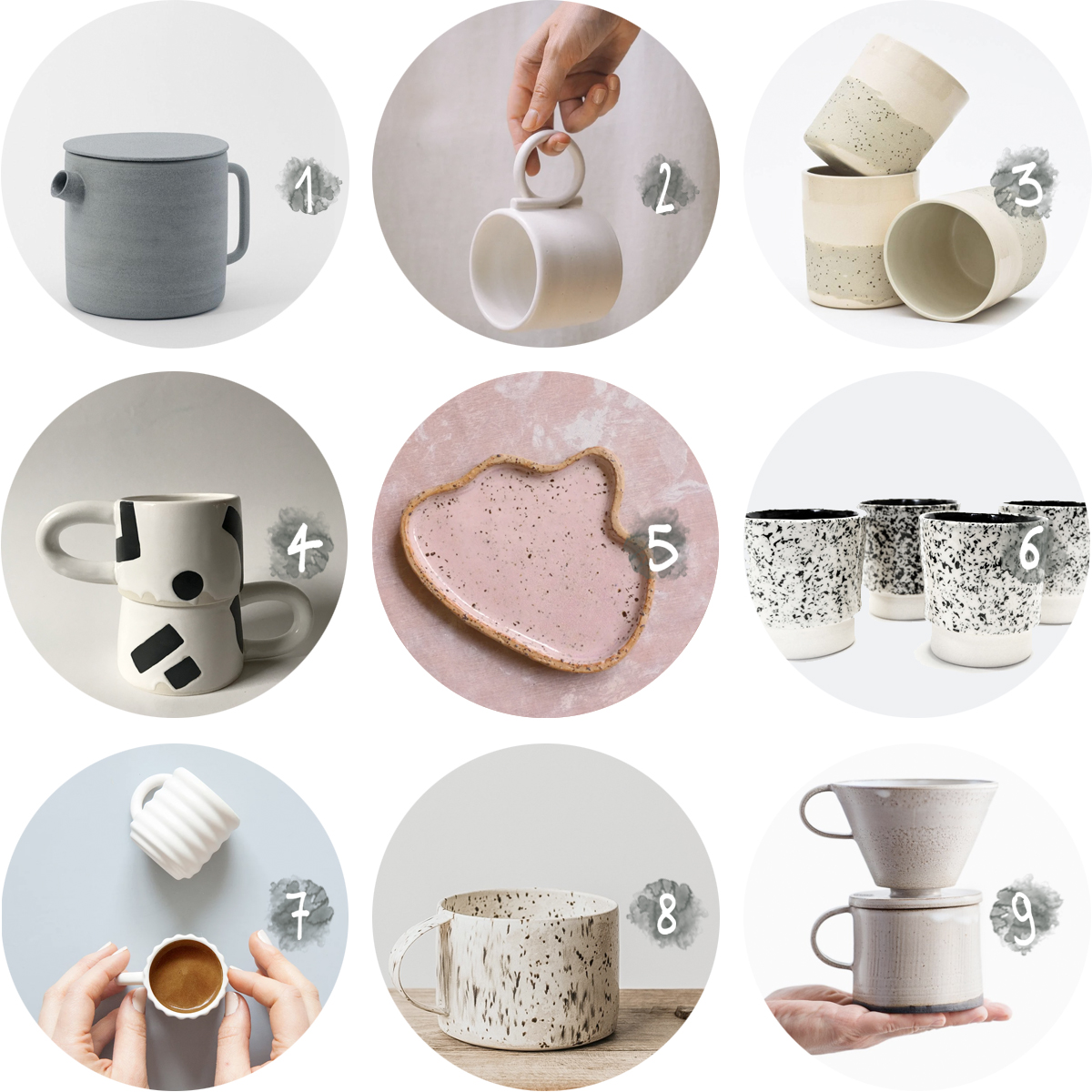
When talking about interior trends in 2019, handmade ceramics is one that you cannot miss.  I’m not usually one to follow trends (I prefer to buy things that I will love for a long time, more on that here), but buying objects made with love by talented designers is something I can get behind.  These items might cost a little bit more than your average coffee cup or teapot, but if you look at them as functional pieces of art – they are pretty affordable.  I’ve collected a few of my favorites from local and not so local artisans, but if you can’t get enough: have a look at my pinterest board!  You can already find one of these designs in my home (can you guess which one?), but looking at these, I might have to add a few more…

  1. Teapot by Ghost Wares, available here.
  2. Loop handle mug by Iandyourceramics, for sale here.
  3. Apricot and speckled cups by Maevo Studio.  Get it here.
  4. Black and white mugs by KBclay.  Order them here.
  5. Candy plate by Clay Club.  Find it here.
  6. Speckled espresso cups by Lauren Van Driessche.  Buy them here.
  7. Ripple espresso cups (cast from a 3D printed mold) by Bilge Nur Saltik.  Get your hands on them here.
  8. Speckled mugs by Barton Croft.  Discover them here.
  9. Coffee dripper by Birdmans Home.  For sale here.

WORK_ Caroline Notté

WORK_ Caroline Notté by Hannelore Veelaert for aupaysdesmerveillesblog.be

A few months ago I was asked to photograph the studio of Caroline Notté for De Morgen Magazine.  Not knowing her work, I was pleasantly surprised when I discovered my shoot location of the day.  When I showed a few sneak peeks of the interior on Instagram and asked if you’d be interested in a blog post about it, you were pretty clear.  So here it is!

The studio of the Brussels interior designer and architect is located in Ukkel, a rather fancy neighborhood in Brussels. The gallery found its home in architect Louis Herman de Koninck’s former home.  Built in 1924 by the designer of the famous Cubex kitchen himself, the building is an absolute icon of Brussels modernist architecture.

Caroline Notté gave the iconic building a new life as her office and a “collector’s cabinet ” where avant-garde designers, artists and visual artists are displayed and for sale. The gallery, with works by David Umemoto, Pol Quadens and Sammode Studio  is open every Thursday, Friday and Saturday from 2pm to 6pm and absolutely worth a visit.

Caroline Notté Gallery - Avenue Fond'Roy 105, 1180 Ukkel - website - instagram

PS. Curious for more of my work?  Have a look at my portfolio, my archive or stay up to date through Instagram!

Read More

AT HOME_ my bedroom

FRAGMENTS_ my bedroom - Hannelore Veelaert for aupaysdesmerveillesblog.be

An interior is often a work in progress and that’s no less true for mine.  Change is coming in my home (more on that later), but first I wanted to update you on what it looks like at the moment.   It’s hard to believe I haven’t shared pictures of my bedroom here before, as it’s been one of the most finished rooms for a long time.  The finishing touch however, was the carpet that I moved from the living room.  Now the space feels much lighter, less empty and the carpet is a joy to set foot on when I wake up in the morning!  I’ve kept the rest of the bedroom light too, thanks to my parents’ old sideboard which I gave a coat of white paint and white linnen sheets.  They let my plants, clothes, jewelry and the few decorations I have on display take all the attention.  Enough talking now, let’s see those pictures!

Read More

1 2 3 4 5 6 76