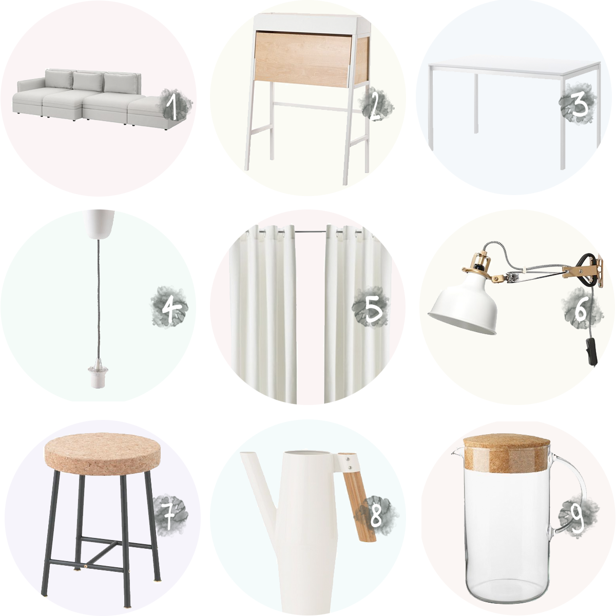
In today’s post, I wanted to share the items I selected at Ikea for my studio and explain why. You already caught a sneak peek in last week’s post about the studio and what I’d like it to look like, but here are the items in their full glory!
- My initial thought was to choose a visually light sofa, like this one, that wouldn’t be too heavy on the eye in the small space I live in, but when the VALLENTUNA collection was launched, I knew this was the way to go. This collection exists of different components (ranging from different seating options to arm- and backrests), so you can put together your perfect sofa, for instance with extra storage space or with a hidden bed! I chose to recreate the image of a “classic” sofa (unlike the one you see in the image above), because I wanted to keep this big piece of furniture simple, and opted for components with extra storage room. Perfect when you’re living in a small place like I am!
- I spend a lot of time behind my computer for my blog and photography jobs so I need a proper place to work at. The drawing table I used in my former bedroom would take up too much space, but working from the kitchen table seemed as if my home would always be a mess. This PS 2014 secretary is ideal, because it is small, it hides all the clutter on my desk in an instant, and if I do need more space once in a while, I can still move to the kitchen table!
- This table is located in the corner of the kitchen, which is quite a narrow space. That’s why I didn’t want it to draw too much attention. I opted for this simple white one named MELLTORP, which is placed against the wall. When I have people over, I can move it away from the wall to offer place for four people (maybe even five?) and leave just enough place to move from the kitchen to the living room.
- This SEKOND chord set is the perfect start to create your dream pendant lamp. You do need to take the lamp socket apart and screw off a few pieces, but then you can easily add a lampholder sleeve and a light bulb of your choosing to recreate that expensive lamp you couldn’t afford. You’ll see the result in next week’s post!
- White curtains were on the top of my list to change the entire atmosphere of the studio. The MERETE curtains are ready made and an affordable solution.
- As the space is so small, I didn’t want to bring in to many different elements. I already owned one of these RANARP spotlights and still loved it, so I decided to add a few more.
- This gorgeous SINNERLIG cork stool functions as a plant stand and offers extra seating whenever I have people over. Win win!
- Last time I checked, I owned 25 plants, so a pretty watering can is no luxury, especially if it fits into your interior so as perfect as this BITTERGURKA. Practical doesn’t mean ugly and I’m a firm believer of surrounding yourself with objects you adore.
- Same thing goes for this pitcher from the IKEA 365+ series. I never drink bottled water so you’ll always find a carafe with tap water on my kitchen counter or somewhere else around the studio, which means it’d better be pretty!
If you’re following me on instagram, you might have caught a few sneak peeks of the result on instagram stories, but next week I’ll give you the full tour of my studio in a final post about this collab with ikea. Missed a previous post? You can find all of them here.
Items featured in this series of posts were generously gifted by Ikea. All opinions are 100% my own. Thank you for supporting partners that help me to inspire you!
Heel benieuwd! x